

 I went to an "official" Sam Adams Beer Tasting on Monday at the Epcot Food and Wine Festival (going on till Nov 9th, so if you are in the area, check it out!)
 For months there have been mumbles and grumbles that the greatest beer bar in Florida (and possibly the South East U.S.) was going to be moving. I know what you are saying "they are just moving... don't be such a baby" (I'm at stomping elephant right now). True, but Redlight Redlight's current location is so perfect that I am afraid that they wont be able to duplicate the small "hole-in-the-wall" slash neighborhood bar feel that they have established with their Winter Park location. The mere fact that you have to go up some stairs is enough to make this hidden gem something completely unique in Central Florida, where bars have to be either Miami chic (glow in the dark Miami Beach mural included) or some sort of Disney-fied (Copyright Beer Guerrilla © 2008) theme bar. From what I have heard on the grape vine, the new location will be larger, have food (please have bananas, please have bananas, please have bananas), and an even larger selection of craft and imported beer. I will be checking out their new location as soon as they move with the hope that they will have the same magic as they had in their little beer-haven hideaway in Winter Park.
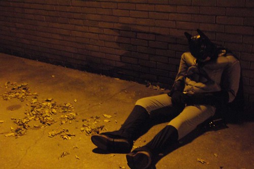
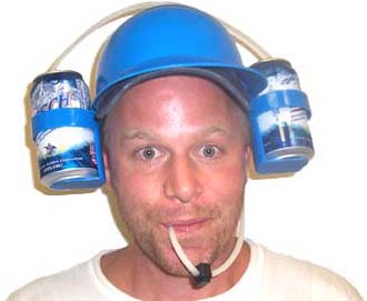
 Have you ever felt like you needed to drink beer while grooming a friend or swinging from a vine? Are you the type of person that wants a Batman-style utility belt with the purpose of maintaining a healthy buzz? Want to have a six-pack (no, not six-pack abs) on your waist?
 I missed the Vice Presidential Debate last night getting myself in the Halloween spirit. But, I have been catching up on all the ins and outs of the political dialogue taking place online. I personally hope all of the candidates believe in evolution. I'm not saying that I'm a scientist or anything, but tell me you don't see the resemblance between me and Lou Ferigno. And since I am feeling slightly political, I thought I'd drink Anchor Brewing Co.'s Liberty Ale
 I love the way that they used the raised type and metal finish to create a feeling of exclusivity and fanciness. I wish they would have done something nicer with the shape of the actual sticker, but overall this Limited Edition brew feels like a special bottle of beer and that's one way to get the consumer to pick up your product. Haven't tried this bottle yet, but it looks like I might, if I find it.
 I really like the way the type is set, the illustration of the dog, and the color scheme on this label. The bold type and color choices make this bottle stand out in a shelf full of beers, that's a good thing. All of their labels have similar designs except for different color combinations, so it also gives them a strong brand connection as well. It might not seem like anything special, but it's simple, readable, and well-crafted label caught my eye. I pretend to be as bad-ass as that dog too... but I look silly in the hat.
 Festive and colorful, this bottle truly does stand out from the crowd like a ape in a tracksuit (trust me... even tracksuits cant help this ape blend in to the New jersey douchebag bars). A lot of labels have clashing type and illustration styles, so the hand-illustrated type is nice because it goes perfectly with the style of the illustration and the theme of X-mas. Kudos to Midnight Sun Brewing Company for bringing out colorful and crazy labels from such a cold place (Alaska people... Alaska is bringing the heat!).
 This is the first of these beers that I have tried (tasty), so I can tell you from experience that the design influenced me to pick up this six-pack. The Great Divide Brewing Company is located in Denver and their branding revolves around outdoor activities found in the area (from rock climbing to mountain biking). All their labels have similar type treatments and style so that their brand is coherent and speaks to the consumer that might not only share similar interest, but also to those who are just looking for a quality beer. Also the distressed type perfectly compliment the theme of getting outside and maybe a little dirty.
 I have also tried this truly interesting beer from Dogfish Head. It's one of their only beers that deviates from their shark logo labels (which I'm not a fan of), I believe that was done to differentiate it as a more premium selection from them, since the price is a bit higher than most of their other beers. The type is elegant with a ancient Greek feel without hitting you over the head wit it. The color scheme also works really well using complimentary colors (purple and a gold yellow). The thumb print adds some extra texture to it to bring some interest to a very simple label. I also really like how the thumb print is repeated and reversed (color-wise) on the bottle neck. Too bad more of Dogfish Head's packaging doesn't have the similar "golden touch" I see in this design.
 This is one of the tastiest beers I have ever had and the main reason why I tried it is because my friend (now girlfriend and huge fan of my blog ;-) ) really liked the label when she saw it in the beer selection book at Redlight Redlight. Its playful and simple illustration style is extremely inviting and… what the hell… the label is just damn cute! The type works perfectly with the illustration and adds to it's whimsical character. If you haven't tried this beer, it's not only fun to look at, it's fun to drink. Enjoy!
 Hitachino Nest Beers big bottle's design don't change from style to style except for the bottom sticker that reflects what style it is. I'm showing their Red Rice Ale, which I haven't tried. The bright colors and the iconic looking owl logo really stand out from the brown bottle. This beer is made in Japan and the style of the owl and the type reflect that aesthetic. The first time I tried a Nest Beer I had gotten take-out sushi and was looking for a Japanese beer to go with it that wasn't a typical Sapporo or Kirin. This beer instantly told me "I'm from Japan... and I'm interesting".
 Rogue Ales is one of America's best known craft beers for a reason, great tasting beers and smart marketing. All their bottle designs are great, but I really like their XS bottles. The opaque black bottle and simple vertical type really stand out. It's simple, elegant, and almost dangerous with it's color scheme of black, red, and gray. The rubber stopper is an extra element that adds to the specialness of the bottle. This beer makes me want to start a beer revolution (oh wait... I'm already trying that).
 And at the top of the list is another beautifully designed bottle by Rogue Ales. For this beer they partnered with Iron Chef Morimoto and produced the Morimoto Signature series that includes the Soba Ale and Black Obi Soba Ale. This bottle stands out because of the white finish that makes the strong and colorful calligraphy really "POP" (I hate using the word "pop" but it seemed actually appropriate, for once). The colors are beautiful, the calligraphy is incredible, and the bottle as a whole is completely unique. It is one of those few bottles that doubles as a work of art that you might keep after drinking… and that makes it the beer bottle that stands out the most out of all the bottles that I've seen in my humble ape-inion.

