skip to main |
skip to sidebar

Your favorite ape has been celebrating all week… opening presents (mostly bananas!) and trying not to feel 28. To go along with my celebratory mood I have been drinking Ayinger Celebrator Doppelbock. This beer has a malty and toasty smell, a sweet malt flavor, and pours a nice brown color. It's not too heavy and with the cooling weather, I was ready to start drinking fuller-bodied beers. Tomorrow I will be continuing the celebration with a bar-crawl (man, I wish I could walk upright).
I forgot to mention the coolest thing about this beer, besides it being extremely tasty, is it comes with a great little plastic ram ornament hanging on every bottle neck of the four-pack. I love that little detail! I must have 4 or 5 little rams hanging out in my tree house by now. What do you feed little plastic rams? Little plastic carrots?
I believe that design is an important part of selling anything. Unless you are a connoisseur the only thing that is influencing you when you are staring at hundreds of bottles of beer is the packaging. It has to stand out enough to make you pick it up and say "Maybe I'll try this one". After that it's up to the actual beer to speak for itself once you taste it. There are surprisingly few breweries that understand this... I congratulate the ones that have put considerable effort in trying to stand out. Here are the Top 10:
#10- Samuel Adams, Chocolate Bock
 I love the way that they used the raised type and metal finish to create a feeling of exclusivity and fanciness. I wish they would have done something nicer with the shape of the actual sticker, but overall this Limited Edition brew feels like a special bottle of beer and that's one way to get the consumer to pick up your product. Haven't tried this bottle yet, but it looks like I might, if I find it.
#9- Hair of the Dog, Ruth All American Ale
 I really like the way the type is set, the illustration of the dog, and the color scheme on this label. The bold type and color choices make this bottle stand out in a shelf full of beers, that's a good thing. All of their labels have similar designs except for different color combinations, so it also gives them a strong brand connection as well. It might not seem like anything special, but it's simple, readable, and well-crafted label caught my eye. I pretend to be as bad-ass as that dog too... but I look silly in the hat.
#8- Midnight Sun Brewing Company, Cohoho! Imperial IPA
 Festive and colorful, this bottle truly does stand out from the crowd like a ape in a tracksuit (trust me... even tracksuits cant help this ape blend in to the New jersey douchebag bars). A lot of labels have clashing type and illustration styles, so the hand-illustrated type is nice because it goes perfectly with the style of the illustration and the theme of X-mas. Kudos to Midnight Sun Brewing Company for bringing out colorful and crazy labels from such a cold place (Alaska people... Alaska is bringing the heat!).#7- Great Divide Brewing Company, Titan IPA
 This is the first of these beers that I have tried (tasty), so I can tell you from experience that the design influenced me to pick up this six-pack. The Great Divide Brewing Company is located in Denver and their branding revolves around outdoor activities found in the area (from rock climbing to mountain biking). All their labels have similar type treatments and style so that their brand is coherent and speaks to the consumer that might not only share similar interest, but also to those who are just looking for a quality beer. Also the distressed type perfectly compliment the theme of getting outside and maybe a little dirty.#6- Dogfish Head Craft Brewery, Midas Touch Handcrafted Ancient Ale
 I have also tried this truly interesting beer from Dogfish Head. It's one of their only beers that deviates from their shark logo labels (which I'm not a fan of), I believe that was done to differentiate it as a more premium selection from them, since the price is a bit higher than most of their other beers. The type is elegant with a ancient Greek feel without hitting you over the head wit it. The color scheme also works really well using complimentary colors (purple and a gold yellow). The thumb print adds some extra texture to it to bring some interest to a very simple label. I also really like how the thumb print is repeated and reversed (color-wise) on the bottle neck. Too bad more of Dogfish Head's packaging doesn't have the similar "golden touch" I see in this design.
#5- De Dolle Brouwers, De Dolle Ara Bier This is one of the tastiest beers I have ever had and the main reason why I tried it is because my friend (now girlfriend and huge fan of my blog ;-) ) really liked the label when she saw it in the beer selection book at Redlight Redlight. Its playful and simple illustration style is extremely inviting and… what the hell… the label is just damn cute! The type works perfectly with the illustration and adds to it's whimsical character. If you haven't tried this beer, it's not only fun to look at, it's fun to drink. Enjoy!
#4- Kiuchi Brewery, Hitachino Nest Beer Hitachino Nest Beers big bottle's design don't change from style to style except for the bottom sticker that reflects what style it is. I'm showing their Red Rice Ale, which I haven't tried. The bright colors and the iconic looking owl logo really stand out from the brown bottle. This beer is made in Japan and the style of the owl and the type reflect that aesthetic. The first time I tried a Nest Beer I had gotten take-out sushi and was looking for a Japanese beer to go with it that wasn't a typical Sapporo or Kirin. This beer instantly told me "I'm from Japan... and I'm interesting".
#3- Rogue Brewery, XS
 Rogue Ales is one of America's best known craft beers for a reason, great tasting beers and smart marketing. All their bottle designs are great, but I really like their XS bottles. The opaque black bottle and simple vertical type really stand out. It's simple, elegant, and almost dangerous with it's color scheme of black, red, and gray. The rubber stopper is an extra element that adds to the specialness of the bottle. This beer makes me want to start a beer revolution (oh wait... I'm already trying that).
#2- Flying Dog Brewery, Flying Dog (Doggie Style) Classic Pale Ale
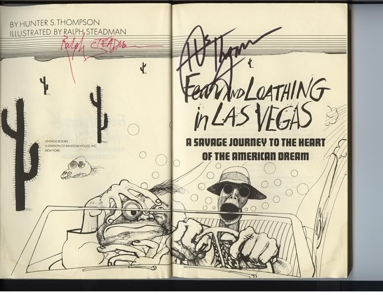
 Flying Dog Classic Pale Ale was one of the first craft beers to come out with a provocative design and put the beer world on notice that there was a change in the wind. This funky and slightly deranged label was designed and illustrated by Ralph Steadman, The famous illustrator that collaborated with Hunter S. Thomson on Fear and Loathing in Las Vegas. His style gives the beer a sense of edginess by the way he attacks the paper with his ink splattering ink all over. He flings ink like I fling poop… angry but beautiful.
#1- Rogue Ales, Morimoto Imperial Pilsner
 And at the top of the list is another beautifully designed bottle by Rogue Ales. For this beer they partnered with Iron Chef Morimoto and produced the Morimoto Signature series that includes the Soba Ale and Black Obi Soba Ale. This bottle stands out because of the white finish that makes the strong and colorful calligraphy really "POP" (I hate using the word "pop" but it seemed actually appropriate, for once). The colors are beautiful, the calligraphy is incredible, and the bottle as a whole is completely unique. It is one of those few bottles that doubles as a work of art that you might keep after drinking… and that makes it the beer bottle that stands out the most out of all the bottles that I've seen in my humble ape-inion.
*I'd like to thank BeelLabels.com for providing me with a resource in order to research beer bottle and label designs. Please check out their site if you are interested in finding out what other beers might have interesting labels, or just curious about finding out more about breweries and beer from around the world.

Your favorite ape has been dormant for a bit... I've been battling a bout of acute laziness. It was quite serous, but I think I'll be able to pull through. I'm past the worst of it, I think.
Most people know that apes like their fruits. Some even say it's nature's dessert... although I was able to steal some cookies from an ape-loving scientist's backpack, and I have to say those were much sweeter! But that is neither here nor there. Tonight I've decided to enjoy some fruit infused beer… I tend not to like very sweet beers, so Dogfish Head's Aprihop is right up my alley. It's got a sweetness that balances itself out with the hop flavor (hence the name). Aside from the balanced flavor, it's also very smooth and drinkable. It has a nice amber color with medium head and a light smell of apricot. The only thing disappointing about this apricot infused IPA is the super light aroma... but once I get past that it's a quite enjoyable summer beer. Get yourself a 4-pack, sit outside, and enjoy a non-dessert, fruit-infused beer.


